 |
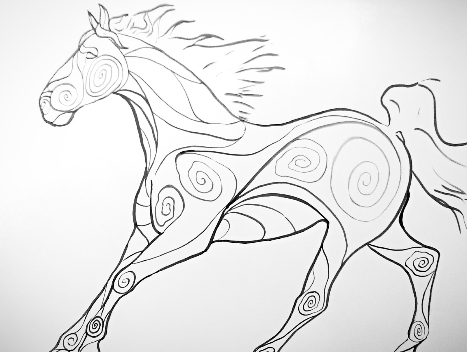
| "Untitled by Bmode" India ink on Bristol board 18x24 |
I knew I was going to draw a horse (no surprises there), so I went through one of my coffee table books on the subject and chose a photo by Bob Langrish for my reference. For those of you who don't know, Bob Langrish is pretty much the god of equine photographers. He has shot nearly any equine subject that I can think of, and many of his Horse Illustrated magazine posters graced my walls when I was a kid. I may or may not have a slight inferiority complex when it comes to my art, so it was an utter revelation when I was looking at these photos and noted that the whole horse was NOT entirely in focus all the time! It's really hard to get crisp photos of a horse moving at speed, and I felt so much better about myself when I saw blurry hooves in some of his photos of horses galloping. Because, guess what, a lot of my photos are somewhat similar. Of course, nearly everything else is totally on point- the lighting, the composition, et cetera- yet I felt a little relieved that I didn't necessarily have to be so ridiculously harsh on myself about such a technical point. Equine photography is often about capturing a moment of beauty, grace, and power, and the feelings that these great animals inspire in us. Piffle if the hooves are a bit blurry.
I set up my workstation, put on a bit of music, and went to work. Music is a part of the human identity, and therefore also a part of an artist's identity. Even as early as seventh grade, I remember my art teachers putting on the radio and us kids getting our creative groove on. It was especially a big deal in my high school drawing classes, where our teacher allowed us to bring in CD's of our own. I discovered a few new artists like this, but I owe a lot of my taste in music to my older brothers. For art making purposes, I gravitate towards classical, trip-hop, electronica, ambient and downtempo. There's a free online radio station called Jango that has helped me discover even more artists, such as Bmode, Nightmares on Wax, and Aphex Twin. I've also become extremely fond of Nujabes, whose music is unfortunately awfully expensive to buy, but there is a good Youtube mix out there if you fancy trying him out.
Getting the horse's proportions down first with a pencil sketch took awhile, with the front legs below the knee giving me the most difficulty. I was fairly successful, given that I don't often draw on a large scale like this. Originally, I was going to use gouache paint, but my tubes of paint had dried solid. Next to the gouache was a canister of unopened India ink. It was a smashing success, and I do believe there will be more experimentation with the medium. It felt magical and effortless as I wielded brush and ink over Bristol. I know that there's a lot more to India ink than crisp lines, but it served my purpose so very well in this regard.
No comments:
Post a Comment